


Well, a new year means a new color of the year. This year Pantone has declared Greenery to be that hue. They declare it to be a color of new beginnings, life affirming, which in nature it surely is, where greens represent rejuvenation.


Here is a fabric swatch from Pantone of Greenery. It is bright and vibrant, a yellow green, and is complimentary to many other colors, depending on the degree of vibrancy you want to achieve.
After the color was announced by the Pantone Color Institute, social media did not embrace it with lots of enthusiasm. It had already made it’s appearance on the fashion runway, and we can expect to see it in interior design as well.

Pretty, isn’t it? source
According to Laurie Pressman, vice president with Pantone Color Institute,Pantone’s team’s around the world typically spends the year studying trends in fashion, consumer products, social media and technology. It looks for influences that best describe the current mood of society and picks a color to reflect those elements. source. So although they declare it, the color is already making itself seen. My personal feeling is that fashion sets the tone for what we can expect, and pantone recognizes it. It has already appeared in cars and in makeup. I like green, but I have to admit that I wasn’t excited at first when I received the announcement. All I could imagine was back to the 60’s (70’s?) when green shag carpet and green bamboo patterned wallpaper was everywhere. However, when I thought about where I had already seen it, it appeared as fresh, crisp and modern. So don’t give up yet.
So let’s take a look at the color and how it is now being used or can be used.

Elmira Stove Works, maker of vintage-styled kitchen appliances, offers this choice. Not sure I would gamble on such a long term commitment to this color, but it is now available. source

A 2017 Skoda Citigo in Spring Green Metallic. There is also a 2018 Mercedes-AMG GT R sport car in a bright green, which goes on sales in 2018. When you see it on a car, it comes across as ok- fresh, spunky! source

As you can see, it doesn’t take a lot of this color to add vibrancy. One window, and a few green pieces in the see thru cabinets add just the right amount. The coolness of the silver colored metal chairs is a nice balance. photo source

Paired with turquoise, it lends a bright tropical edge to this pool space. photo by Dan Piassick. source

I really like this chair. It has some kick, and in this case works with purple, and with the chair pillow, picking up the wall colors and lending some balance. You could take a chair like this and place it in an all white room, and it would still pop, just like the single window pane in the first photo. source: David Bromstad

Here a single wall around the window adds brightness and relief from all the white. It lends some balance to the gray counters. With some additional color added via pottery or plants, this will be a modern interpretation.

Designer Suzan Wemlinger created a bright green and white bathroom that is both bold and sophisticated. The wood cabinet adds warmth. The choice of silver for the mirror, the faucet and light fixture lends modernity. photo source

The more I studied this room, the more I came to like it a lot. Here the green is mixed with a deep, rich turquoise, brown velvet chair seats, brushed metals and gorgeous silt taffeta curtains. There is a perfect balance of white in the room as well. The warm woods lend a warmth. Elegant. source

This represents a classic paint combination, Navy, white, green and gray. Below are photos of using each color to a varied degree and intensity. photo source

Greenery is a good color choice in a baby or child’s room. It is gender neutral, provides the brightness children need and like, and, as in this room, it is a happy color. The tiny bit of red in the pillow adds a wonderful pop of cheer. photo source

This green is slightly toned down, but even if as bright as above, it still would look terrific. Here the navy is in more than just the rug, but also in the dressers and curtains. The white crib and carpet keeps it from being too intense.

In this babies room, the wall color is switched from green to navy. The white trim and framed photos helps to keep it bright. The black in the black and white stripped carpet adds another dimension. photo source

In this older children’s room, the green is paired with a tiny bit of black and white (stuffed penguin), and more color from the art and nick-knacks above the desk. When used in smaller amounts, you can still achieve the goals in choosing green, but in a less saturated way. I do find however, that children are much more eager to readily make bold color choices than adults are. photo source

Here, two more tones of green are added to the brighter hue. The effect is one of calm and elegance. You can barely see the trees out the window and this room I am sure effectively connects the interior with the exterior, visually expanding the space. photo source

Just changing out the pillows on the sofa in the above photo with the examples from this photo allows you to choose how much of each color value you want to have in the room. photo source

In this room, a lighter hue of the vivid green was used with a muted navy sofa. Even small does of green can effectively achieve that connection to the outdoors. Even the simple addition of the darker green leaves of the tulips in the vase, does a lot to add to a feeling of nature indoors. The texture and patterns from the textiles and some of the furnishings in the room also adds interest. photo source

The greenery color of the plant branches if just as effective, and is temporary and a good way to introduce a pop of this years color to a room. No commitment necessary. photo source

Ok, now let’s look another option, turquoise and gray in the mix. photo source

All the above colors are represented in this room. It has a breezy, airy feeling to it, and yet it includes the bright green color of the year. The fabric above is not the exact pattern we see here, but very close.

In this bathroom, a more permanent choice of tile in a bright green is sure to make taking a shower a bright start to the day.

If you are still not convinced about using it in larger quantities, the are a myriad of ways to introduce it in small and much less permanent ways. I like this small bedside lamp for that pop of brightness. Greenery really goes well with gray, which is a color in this room-the headboard, the little lunchbox and old clock add a bit of whimsy also.

Likewise, in this bedroom, two bedside table lamps provide a bright boost of color.

In this vignette, Black table lamps add a casual elegance to the green painted chest. The blue, white, black and green of the book bindings add texture and well as tying the arrangement together with the additional colors.

The turquoise on the bottom quarter of the curtains adds interest as well as echoing both colors seen in the bed pillows. Even with the bright colors I would call this room a soft approach to using bright colors. The soft blue of the blanket on the end of the bed is repeated in a slightly darker tone on the ceiling, pulling the entire room together. The woods tones of the furniture lends a warmth to it all.

Here the gray on the walls is the perfect calming color for the bright of the green blanket and sofa. We can’t see it, but I am sure there is plenty of greenery outside the french doors. The sienna color of the wall art echoes the pillows on the couch.

IN this combination living-dining area the shots of bright green make for a welcoming room. Because the windows are not large and that there may not be any shrubbery visible, I would add a large ficus or like shiny leafed plant in the corner, which would add some texture and another shade of green.

This sophisticated room uses just a single piece of bright green upholstered chair, but the greenery outside the front window bridges the gap, with the flowers in the middle. Again, black and gray are used quite successfully in this bright living area.

In a girl’s bedroom, an addition of a duvet and shams adds green color seen in the rug. Lavender and pink also add color. photo source
Below I offer the many color pathways for adding a bit of Greenery to your decor. From a little to a lot, there are colors that almost all of us could work with. I hope they might inspire you.

photo source

photo source
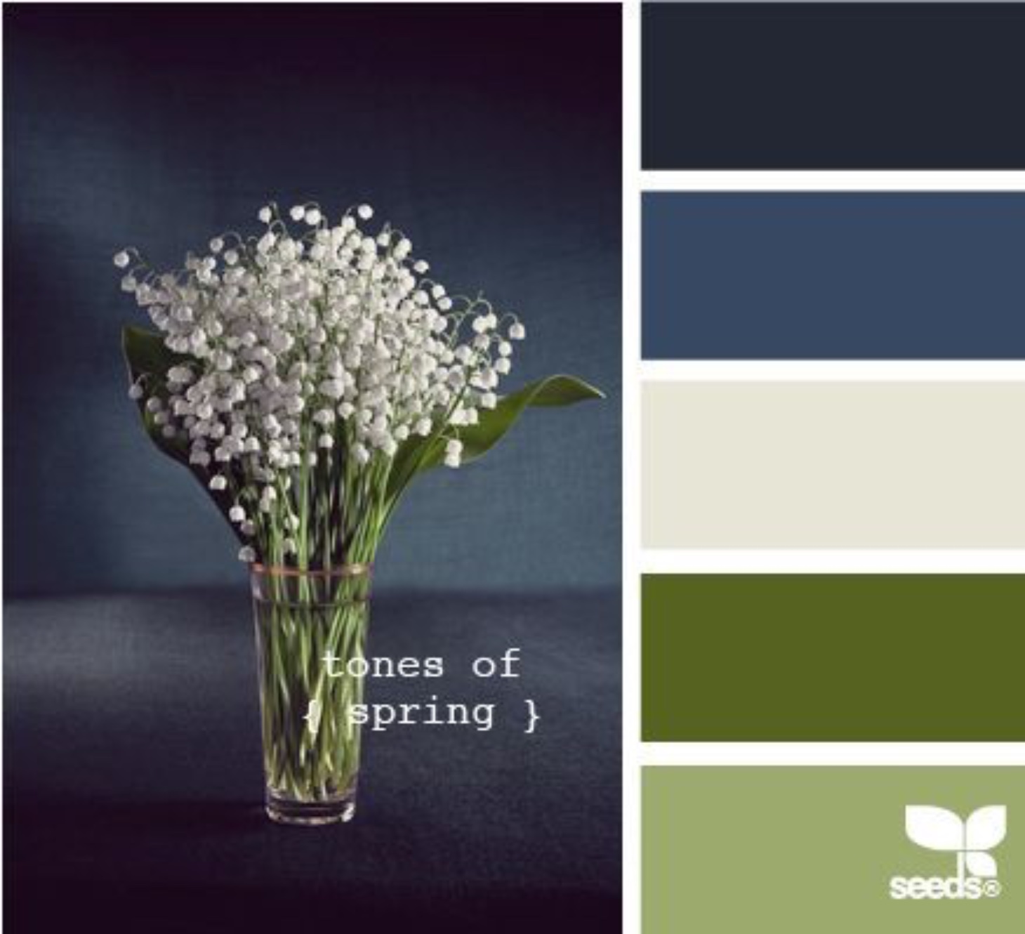
photo source

All these greens can work well together. Perhaps one will work with the colors you know have in your home? photo source


Even if you are still a little unsure as to the degree you might like this bright green, I only hope that I have shown you that this is not an all or nothing color. In the in-between can come some wonderful introductions of Greenery to add life, vigor and nature to the inside and outside of your home. photo source
One of the design “trends” this year is vines and plants in the home. I think they should always have a place in some part of your home, so I hope I have inspired you to look at this green in a new or different way, and perhaps find a place for it in your home. I would be willing to bet, if you begin to look around you now you will see a lot of it in many places you frequent. Now maybe you will notice and look at it with different eyes and appreciation.
Thanks for stopping by. laters, charisse


I picked out Amazing Gray and Reflecting Pool then spotted your page and plan to add “greenery”.
Glad you found the post and that it inspired a color addition to your palette. Thanks for stopping by the blog! charisse
Charisse, what a fabulous post! Can’t imagine the effort it took! Thank you!!
I’ve been a huge fan of green for almost 20 years. Both my living room and adjoining dining room are green. Although that sounds BRIGHT, they’re in very muted shades. I was about to paint them a creme color when my newly hired decorator said no way!! Guess she’s on the new color of the year bandwagon!
Always look forward to your posts!
As you know Charisse I just love green!!! I am delighted with this years colors. Can’t wait to go shopping!!
I am definitely into small doses of green coupled with tourquoise and use the combination on my screened porch. Even in the cold, wintery months, when I look out on the porch the colors lift me up with anticipation that spring is surely coming.
Very interesting, Charisse. For me personally, small doses works–otherwise it takes over the room and distracts/overwhelms me. I’m sure others find it wonderful. And the palettes you showed definitely balance the green –thanks for sharing such an interesting exploratory. Sure would like to see something about how to take what you have, recover and change it i.e., we have some wing chairs that we’d like to recover (again) this time to have a contemporary fabric. Or something that shows us how furniture shapes and frames can be assessed as to whether or not they are wonderful shapes and styles. So often I look at the magazines and admire the rooms, but would “never have thought of that” when it came to some of the upholstered and dining chair styles that get rave reviews. Just food for thought….enjoy the day!