If you like porches, then this is a home for you. It has not just a deep and welcoming front porch, but one along the back as well. This home presents classic curb appeal, and the interiors offer so much for the square footage, which is 3227 sq ft. It can be challenging to find a home with a reasonable amount of square footage that has a lot of bells and whistles buyers wish for, and yet isn’t in the realm of wasted or too much space, or lacking in storage. While I really the floor plan, there are some architectural features/details I might have approached differently. It also offers a flexible way to utilize the floor plan, so it will be fun for me to share some of these ideas.
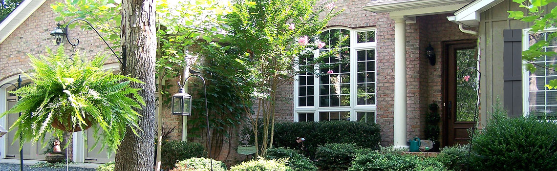
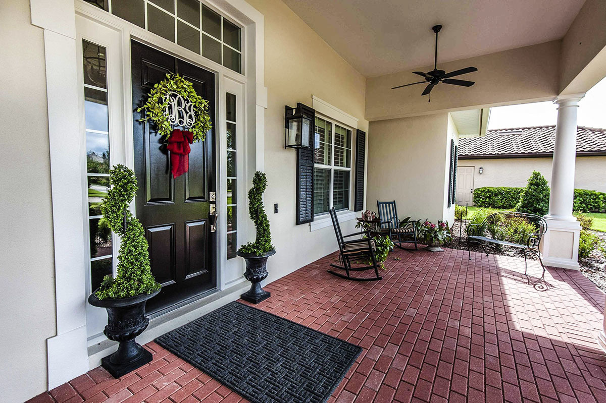
Always charming classic southern architecture.This is a really deep porch. The fans kelp tame the hot and humid southern summers. My preference is usually brick for a porch, but here I would have preferred a more old work brick, and mortar joints that were more level with the brick for ease of cleaning. I might have used lightly stained bead board for the ceiling.Here is the floor plan. It might helps when looking at the photos for perspective. when I make comments. See the niche area that is in the gathering room on the wall of the laundry? I think I might have added additional cabinetry for a coffee &wine bar with a small sink. Or found a gorgeous oversized armoire and made one from that.These ceiling beams are dramatic, but here I would definitely have gone with a more traditional beam arrangement that does not hang down onto the side walls. Why? Because they look top heavy the way they are now. Look towards the kitchen and you can see the last beam. That is what I would have used. Like the porch, I would have added bead or tongue and groove wood on the ceilings, stained light. This plan allows for the kitchen to be open to the main living areas yet visually obstructed until you walk all the way into the house. I prefer not to see a kitchen as soon as I walk in.Nice hard scraped floors. Here I would have added builtin on each side of the fireplace, one of which would hold the TV. At least they have sliding doors to obscure it when not in use. Like the sisal rug, but it should be much larger, which would warm up the room from a lot of hard surfaces.What I like about a straight run of kitchen, dining and living, is that it works great for entertaining, for a large family and if you have pets. In either case, you are not tripping over anyone and rooms like these are so easy to clean. You can seat a very large number of people in this dining space and not have anyone experience difficulty getting away from the table like in many dining rooms that are separate.You could have another eating space here, or strictly a sitting area or a combo like they have here. The chalk board door is for a large walk in pantry. The space along the adjoining wall could also hold more storage space, or bookcases, or display area, or art wall. This plan has terrific flexibility.Nice kitchen if you love white. The varying cabinet height and some glass front cabinets look great.the island in a darker color has unobstructed space for cooking prep and entertaining. Without a window, I would have opted to have either the cooktop or the sink in the island. The drawers are deep and practical.The curved detailed toe kick under the stove makes it look more like furniture.I have never said it on my blog, but I do not care for subway tile unless it has character…..like oversized, or a wavy texture, or mounted in a pattern. For me, and this is just my opinion, it is institutional. I might have opted for a stainless farm sick or one with a textured front to provide relief from all the smooth surfaces. I h….ave a couple of suggestions below…..This would look nice with the counters above. The rough texture is needed in this kitchen and it relates to the floors.And if one wants to stay with the white, how about this one? Both are available at Signature Hardware.
Although I like sliding barn doors, they did make it difficult if not impossible to put art on the walls, or any sort of furniture. There particular ones I might use, but move them so the entrance to the study is from the foyer. If you look at the floor plan, moving them there allows for art or furniture of bookcase here on the above wall. Having the doors in the foyer still means you can have, on the opposite wall, a nice cabinet or table so you have somewhere to drop keys, place mail, and to simply make it more welcoming.Weird placement of the rug, but oh well. I would add Roman shades in the same color way, or drapes like on the french door wall. Looks unbalanced.Needs a different fan, and get rid of the teeny, tiny art over the bed. The chairs in a lighter color or a darker one. Just not the chairs as they are, rather dated.This looks to be a deep and long soaking tub. I made the same mistake in my master bath tub. Notice the front ledge? It is too deep to make it easy to transition in and out of the tub. Half that size would work.Another view of the bath. A nice vanity space for the woman. The opposite side houses a sick for the man. The stained cabinets warm up all the white tile and light walls.The hardwood floors are throughout the entire home except for one or two of the bathrooms, where tile prevails.Nice layout for the Jack and Jill bath for the two secondary bedrooms.Too many times bathrooms are built on inside walls with no windows. Fresh air and ventilation other than a fan are so nice, and necessary really. this window may be small, but it also allows for light. I like the herringbone subway tile, and with a darker grout will be easier to maintain.
For some reason this photo is distorted. If you look at the photo of the front of the house, the windows are full sized. This is a large laundry area so to get most of it in the photo, some camera lenses will do this. Like half bathes, the laundry room is one you can have fun with and put your personality into it. I would use some futile and pops of color. There is great storage in here.The back porch. Even deeper than the one out front, which is about 10 feet deep. Like the fireplace on the patio, although with cold rainy weather, it might get used more if it was under the porch cover. I would also have preferred an antique brick here to match the front porch. When I enlarge this, it almost looks like they used pavers that are set in sand.
I hope you enjoyed this home and find some of the ideas worth pinning or implementing in your own dream homes. I find home tours fun, inspiring and I can usually find at least one idea that sends me off to creating something.
Believe it or not, I woke this morning to cold and big snow flakes coming down. Although everything is covered in about a 1/2″ of white, it is supposed to warm up and the snow changing to rain. They claim high 70’s mid week and then 80’s on Friday. Really? Straight to summer. Pretty though the snow can be, in mid April, charming it is not! I just got an email that Crossing Brook Farm, the wonderful farm stand we love so much will be opening in a week! Yeah to fresh produce and gorgeous garden flowers. Now that helps it feel like spring.