We are officially into the summer season, and the July Fourth celebration is quickly heading our way. There will be many ideas out there for quick holiday decor DIY and crafts, but I thought today I would approach all the red, white and blue from a little bit different perspective. Let’s look at some kitchen spaces decorated in red, white and blue, and from these you might be inspired to decorate your porch, or family room, using this color combo in a more permanent way, or even just for the rest of the summer season. It sure is all American and seems to not only be festive, but one can hardly stifle a smile when in a room that is red, white and blue. While stained-wood and white painted cabinets seem to be the norm, these colors are anything but boring. Kitchens are ruled by function, but there is no reason to ignore a decorating color opportunity. Painted cabinets add interest galore. You can either use solid bright finishes for a more contemporary finish, or for a more casual look, use a matte finish and perhaps even distress door and drawer edges for a more casual look. These kitchens run from subtle to hardly subtle when it comes to using color. Red is often associated with passion and excitement, which means that it can be the perfect color for your kitchen where activity abounds, be it cooking or socializing. Using it in big or small doese, and balance it out with neutral colors, pairing it with blue and white. I tried to find example that are retro, modern and traditional so you can see , in your favorite style, how to introduce a little, or a lot of color, from appliances, to cabinetry to accessories or paint. These kitchen go from sweet and simple to high end designer spaces. Many of the folks who put these kitchens together were not afraid of color in the least……I love it!
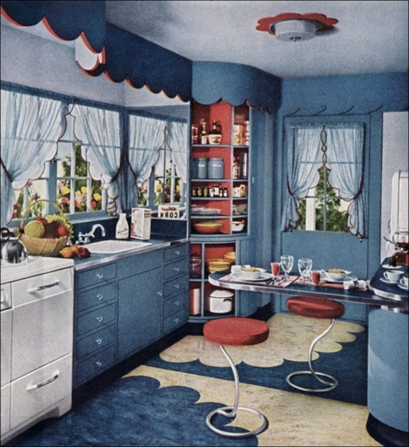
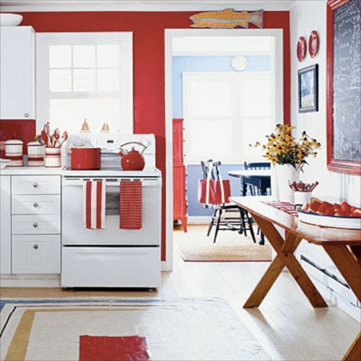
This kitchen is from the 50’s but I found examples of red, white and blue kitchens as far back as the late 1920’s in photos. The color combination has been around for a very long time, and looking back, people used a lot of color. In kitchens today, we seem somewhat intimidated, always concerned about resale.Here is a small, but very cute retro kitchen. Figured I would start small before a POW of color, LOL.A soft blue mutes the impact of the red wall. Lots of light keeps it very cheery.A basically white kitchen with a retro red refrigerator and soft blues. I don’t think red and white checkered tablecloths every go out of style. I really like how the chairs are all different colors, and although there are lots of colors throughout the space, color does not overwhelm. This is a happy space.OK, here we go. This is a statement…. Bright red and delft blue tiles take center stage in a white walled kitchen. Now this is a color packed traditional space for sure.OK, catch your breath, we’re back to white where the owner used blue accented accessories and small pops of red to create a bright country kitchen. The wood chopping block countertops and baskets add warmth to the space. Notice the island is navy blue.Here is another white kitchen space, where red has high impact because it is used judiciously but having big impact.In this kitchen we see red white and blue cabinetry combined in a kitchen with lots of windows and beautiful art. The feeling would be quite different if the banquette was any other color than white.The same kitchen looking from the opposite end. A beautiful use of the three colors in a bright, traditional yet modern space.In this kitchen we see the same three colors used in about the same proportions and the effect is much different. First of all, the owners choose a bright white versus the softer white above. This kitchen is much more linear, none of the curves nor art to relieve the high impact of the color. The previous kitchen also had glass in some cabinets, but the cabinet heights varied and the stainless appliances affects the feel as well. This kitchen I believe was a remodel, and it is certainly a welcoming space for a family to gather.Another view of the kitchen above. Bright even with all the dark color. Perhaps you are seeing where I am going with how the same dark red and blue colors can look so different.In this kitchen the adjoining room is red, and the chosen accents tie the two rooms together. I really like how the owner chose a soft wash of color on the horizontal boards on the wall behind the colonial blue cabinet. It lends interest and softness. The dark stained floors are a perfect compliment.I found this this kitchen to be interesting. To me, the bright red has some impact, but the choice of cabinet doors and antique washed white color, the bead board coffered ceiling and a natural wood table mutes the impact of the color. Yet without the bright color, the kitchen could end up rather boring.In this very small and traditional kitchen, blue is the main color, with seemingly small quantities of red. But not really, as the floor is red brick. The whitewashed walls, and cream counters and dining chair helps keep everything bright.Here red appears to have a bigger impact. Although the cabinets and floor are white, the small amount of paint and the red stove appear to double the impact of the red. The counters are also colored and patterned (I think it is a granite) and it brings the red to that area. The small red accessories have a large impact because it is a small space. Even the red rooster on the round rug works to connect the dots, i.e. all the red. The small green pottery on the hutch cabinet and the bit of green in the painting to the left of the window as well as the lettuce in the bowl help the eye rest.Now to a quite modern space. Shiny surfaces everywhere. Notice the light blue patterned carpet. I love the whimsy of the dog statues on the counter and the table. To those of you that may wince about carpet in a kitchen, I have to share with you that I had a pretty patterned commercial grade carpet in a home (it was the site of a grist mill complete with waterfall) I bought, and I thought I would immediately pull it out. After one week and because it was almost new, I lived with it and learned to LOVE it. It was a breeze to keep clean, it was warm (this was winter in the Finger Lakes!) and I often wonder why I don’t have it now. We all put area rugs in our kitchens anyway. Sorry, I digressed.This kitchen is full of interesting details. Red, white and blue, pattern, texture galore….. I love brick, and here they made terrific use of it. It is usual to put the shelving, decorative or functional, at reachable level. They chose to put them high and put decor items up high. Yet the walls still hold a lot of glassware, signs and a few decor items. The result is still an uncluttered, wonderfully curated display.A high end kitchen with the brick used to form the barrel vault ceiling. Red, white and blue , but a totally different feel. The red is is the wood tones of cabinet sand floor, and minimal use of white. But the visual weight of the white columns in the doorways keeps things balanced and from appearing dark.This kitchen uses color and pattern in an eclectic way. The warm tones of the wood chairs, table and bench keep it from becoming to cold looking. The red knobs, the only red in the room, pop and couldn’t be more perfect.I love this kitchen. Although it is red, white and blue, what you notice more is the casual and welcoming look, the fun decorative items all around. I adore that faucet on the left wall. The worn finishes, the oversized chair pads……all say welcome, come sit a spell. The antique toys displayed in the transoms….what fun!Bright and cheery and with displays of my favorite blue porcelain, a perfect accent for a red, white and blue kitchen.Very subtle use of color accents resulting in a really nice result in using small bits of color in a large space. A nice mix of formal, informal and casual resulting in a rather harmonious space.This was a brilliant way to bring red into a room, by using warm red tones of the stained wood on the ceiling and then counter. The ceiling being cathedral keeps the room from feeling “heavy”, as does the long bank of windows. You can see some of the red cabinetry to the left in the butlers pantry area.The more I looked at this space, the more I saw how beautifully designed it was. Beautifully detailed with the glossy black refrigerator, and glass in the framed art reflect light. The shape of the refrigerator with a curved top is like a work of art in a way. The wainscot on the back wall lends tons of interest that a flat painted wall wouldn’t. The blue wall hung cabinet is unique in construction. They smartly wrapped the white counter down to the floor and used a different color blue for the eating counter. They chose two playful but completely different chairs. The red wall accents complete a thoughtfully planned kitchen, that although small is so cool.The next three photos are of a kitchen that is saturated with color and pattern. Lots of our three colors, even on the ceiling and floor.Another view, this one looking into a living area that has lots of plaid it appears.This all american colored kitchen is in……..Russia! If you look at the lower left, you can see the caption is in Russian. No fear of color here!Lots of white, yet the wallpaper and its pattern has a powerful impact, even though the counters are white and there is lots of light. The strong use of blue accessories adds to the feeling of saturated color.This is a photo from a magazine, but I picked it because it was a bit different. Instead of pot lights, they used a lot of hanging fixtures….eight that we can see. The floor is painted blue wood, the counters wood, and hanging copper pot and pans, the oversized stainless sink says that a serious cook lives here, and that this kitchen is a busy and inviting space. I love the large window, and the rocking chair would be my favorite spot to sit. The red, white and blue braided rug says casual style here….come and be comfortable while I cook for you.A beautiful country kitchen with a red AGA stove, brick, blue cabinet, wood counters and beams, plaster walls and a long harvest table with copper lights overhead….you can feel the history here.Bright white, high ceilings make this compact kitchen appear light and airy, even with good doses of our three colors considering the size of the space.Can’t get much subtler than this. The softest watery blue walls, Tiny bits of red, and lots of white.I chose this kitchen because it uses red, white and blue, but the effect changes dramatically because of the addition of a fourth color with the green wall. It tones everything down. This kitchen has an industrial vibe going on, but the colors lend some interest and the pattern of Roman shades adds some fun.This kitchen is all about texture. The tile stove surround is a balanced focal point along with the blue center island, and the Roman shades are of a heavier fabric to balance all the weight of the tile. The niches above the back wall also help. The red stove knobs add a pop of color.Ok, we have seen some serious All American color in kitchens and I think it is time to head to the pool. And after cooling off in the pool, it’s back to work extolling the possibilities of color, in this case red, white and blue. GO COLOR!Garden Fairies outta my way! I am off to try and save the world from kitchens that are all white top to bottom!
Well, I thank you for coming today. I hope that you came away from reading this post (hopefully not exhausted!) but inspired to see that one can use red and blue in so many different ways with white. Tiny doses, large doses, either way, there can be room for color other than white in your home, and yes, even in the kitchen. Laters, charisse
2 comments
Wow what an incredible amount of research went into this! I love the kitchen with the “high impact, judiciously used” reds.
(And a few others, of course) Great job.


Wow what an incredible amount of research went into this! I love the kitchen with the “high impact, judiciously used” reds.
(And a few others, of course) Great job.
It took some time to find RW&B kitchens, but it was fun. Happy that you enjoyed them.